Creating Components with the Wizard
Reading time: ~5 minutes | Level: Beginner Prerequisites: Tutorial 4: Understanding Components and Data Types
What You'll Learn
- How to launch the Component Wizard
- What happens at each of the 6 wizard steps
- How to navigate forward, back, and skip optional steps
- Tips for filling out each step efficiently
When to Create Components Manually
Most components are created automatically when you upload a data file and the AI processes it. You create components manually when you want to:
- Add a field that was not in your uploaded data
- Build a model from scratch without uploading a file
- Create reusable components for use across multiple models
Launching the Wizard
- Navigate to Components (
/app/components) - Click the Create New button
- The Component Wizard opens
The wizard is a linear, forward-progression flow in create mode. You complete each step before moving to the next. Some steps can be skipped if their fields are optional.
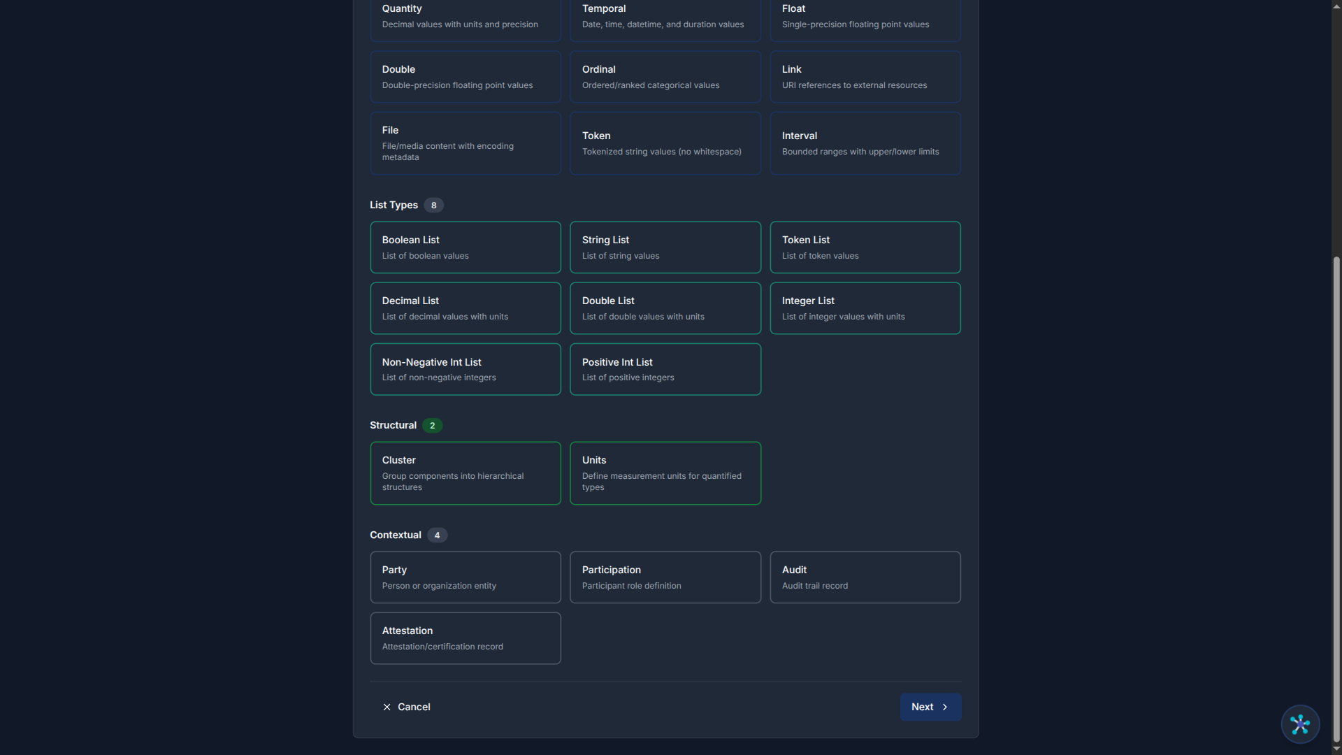
Step 1: Choose Type
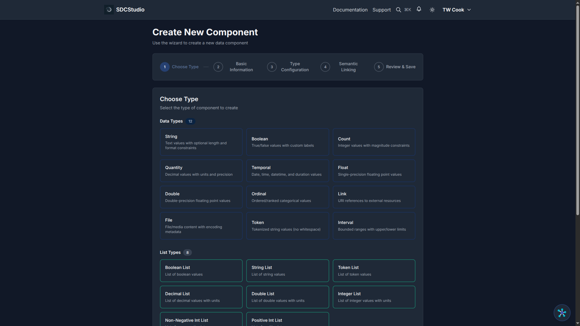
Select the SDC4 data type for your component:
- XdString — text data
- XdCount — non-negative integers
- XdQuantity — decimal values with units
- XdBoolean — true/false
- XdTemporal — dates and times
- XdFloat — single-precision floating-point
- XdDouble — double-precision floating-point
- XdOrdinal — ordered categories
- XdLink — references
- XdFile — files and binary data
- Cluster — component grouping (uses the separate Cluster Wizard)
Choose the type that best fits your data. See Tutorial 4 for guidance on when to use each type.
Click Next to proceed.
Step 2: Basic Info

Enter the core identity of your component:
- Label (required): Human-readable name. Use proper capitalization: "Customer Email Address", not "customer_email"
- Description: What this component represents and how it should be used. Be specific: "Primary contact email for customer communications and account recovery"
- Project: Select which project this component belongs to
- Language: The component's language (e.g., en-US)
Click Next to proceed.
Step 3: Type Config
This step changes based on the type you selected in Step 1:
For XdString: - Regex pattern — validation pattern (e.g., email format) - Min/max length — string length bounds - Exact length — if the string must be a specific length - Enumeration — list of allowed values (e.g., "active", "inactive")
For XdCount: - Min/max value — integer range - Units (required) — what is being counted (items, people, shares)
For XdQuantity: - Min/max value — decimal range - Precision — total significant digits - Scale — decimal places - Units (required) — measurement unit (mmHg, kg, USD)
For XdTemporal: - Allowed temporal types — date, time, datetime, duration - Min/max date — valid date range
For XdBoolean: - Default value — true or false
For XdOrdinal: - Ordinal values — label + code pairs defining the ordered set
Fill in the constraints that apply to your data. You can leave optional fields empty and come back to them when editing the component later.
Click Next to proceed.
Step 4: Advanced Settings

Configure optional advanced properties:
- Sequence number: Controls display order among sibling components
- UI type: Hint for form rendering (text field, dropdown, date picker, etc.)
- Validation flags: Enable or disable optional metadata fields:
- ACT — Access Control Tag
- VTB — Valid Time Begin
- VTE — Valid Time End
- TR — Time Recorded
- MOD — Modified timestamp
- Location — Geographic location
These are all optional. If you are unsure, leave them at their defaults and adjust later when editing.
Click Next (or Skip if you want to accept defaults) to proceed.
Step 5: Semantic Linking

Link your component to ontology concepts using RDF predicate-object pairs:
- The TransferList shows available predicate-object pairs on the left
- Move items to the right to associate them with your component
- To create a new predicate-object pair, click the Create New button
- Use the Google search button (magnifying glass icon) to search for controlled vocabulary terms — this opens a Google search pre-configured with ontology-focused sources (OBO Foundry, BioPortal, LOV, etc.)
Semantic linking is optional but recommended. It adds machine-readable meaning to your component, improving interoperability and enabling richer output generation.
Click Next to proceed to the final step.
Step 6: Review

The Review step shows a summary of everything you entered:
- Type selection
- Label, description, project
- Type-specific configuration
- Advanced settings
- Semantic links
Review all fields carefully. If anything needs adjustment, click the relevant step in the stepper to go back and make changes.
When satisfied, click Create. You will be redirected to the new component's detail page.
Wizard Navigation Summary
| Button | Behavior |
|---|---|
| Next | Validates the current step and advances to the next |
| Back | Returns to the previous step |
| Skip | Advances past an optional step without filling it in |
| Cancel | Exits the wizard without creating anything |
| Create | Creates the component (only on the Review step) |
In create mode, navigation is forward-only — you must complete or skip each step in sequence. The stepper at the top shows your progress and which steps are completed.
Summary
- Launch the Component Wizard from the Components page via Create New
- The wizard has 6 steps: Choose Type → Basic Info → Type Config → Advanced → Semantic → Review
- Fill in required fields at each step; skip optional steps to come back later
- Click Create on the Review step to save your component
- You can edit the component afterward using the stepped edit form
Next Tutorial
Editing Components — The Stepped Edit Form — Learn how to modify existing components and understand the difference between Save and Save & Publish.